Boosting Conversion Rates for SureIn’s Funnel
My role
Deliverables
Design Lead
User Researcher
UX Designer
UI Designer
Graphic Designer
Motion Designer
Design System
User Research
High Fidelity Designs
Team Ideations
Usability Testing
Project Summary
I led the end-to-end design of a self-service funnel at SureIn, enabling users to purchase business insurance directly from our website. The primary objective was to improve conversion rates at key stages, including the overall funnel, the recommendation screen (where users are presented with three insurance options), and the checkout process.
This project involved addressing complex usability challenges, optimizing the mobile experience, and streamlining the user journey to increase user trust and engagement.
This version maintains the focus on your leadership and key accomplishments while sounding more concise and impactful. Let me know if you’d like any further tweaks!
Problem Space
I conducted in-depth research to gain a clearer understanding of the challenges businesses face when dealing with insurance.
#1
43% of companies in Germany are underinsured and risk not receiving compensation in the worst-case scenario.
#2
39% of German companies are paying for overly expensive coverage.
#3
Claiming compensation from insurance companies is often a frustrating and complex process.
#4
Dealing with insurance carriers involves dealing with a mountain of paperwork.
Limitations
Limited Development Resources
Challenge
Only two frontend developers were available, managing multiple projects, including the website, admin panel, user application, and self-service funnel.
Solution
I worked closely with developers during the prototyping phase to ensure minimal development effort. Additionally, I led the company rebranding and redesigned the website using Framer, reducing the reliance on developer resources and freeing up capacity for other projects.
User Recruitment for UX Research
Challenge
Recruiting users for research was challenging due to our B2B audience (40+ years old) and limited recruitment resources.
Solution
I offered discounts and leveraged employees’ personal networks to recruit participants for interviews and usability studies.
Low Traffic for A/B Testing
Challenge
Due to limited traffic, each A/B test iteration took approximately a month to gather sufficient data.
Solution
I conducted in-depth qualitative research prior to A/B testing, allowing us to optimize the design based on valuable insights, even with small sample sizes.
Step #1: UX Research
Goal: Investigate the reasons behind user abandonment in the self-service funnel.
UX Methods:
User Interview
Contextual Inquiry
Affinity Mapping
UX Audit
Heuristic Evaluation
Analitics Research
Experts Interview
Competitive Audit
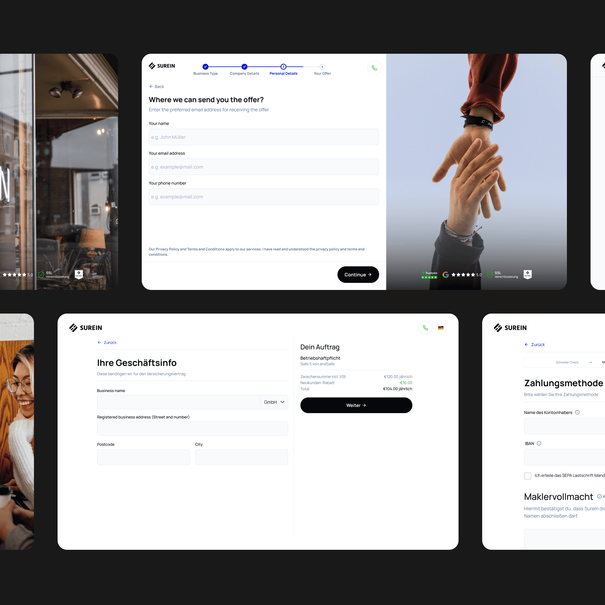
UX Audit & Heuristic Evaluation
I reviewed the user flow of the funnel and identified key UX issues that were immediately apparent:
#1
The funnel and checkout suffered from poor usability and visual design. The design felt inconsistent, with many elements lacking a clear rationale—such as a picture of a coffee table placed on the right side of the screen throughout the entire user flow.
#2
The mobile experience was especially problematic, making the funnel nearly unusable on smaller screens.
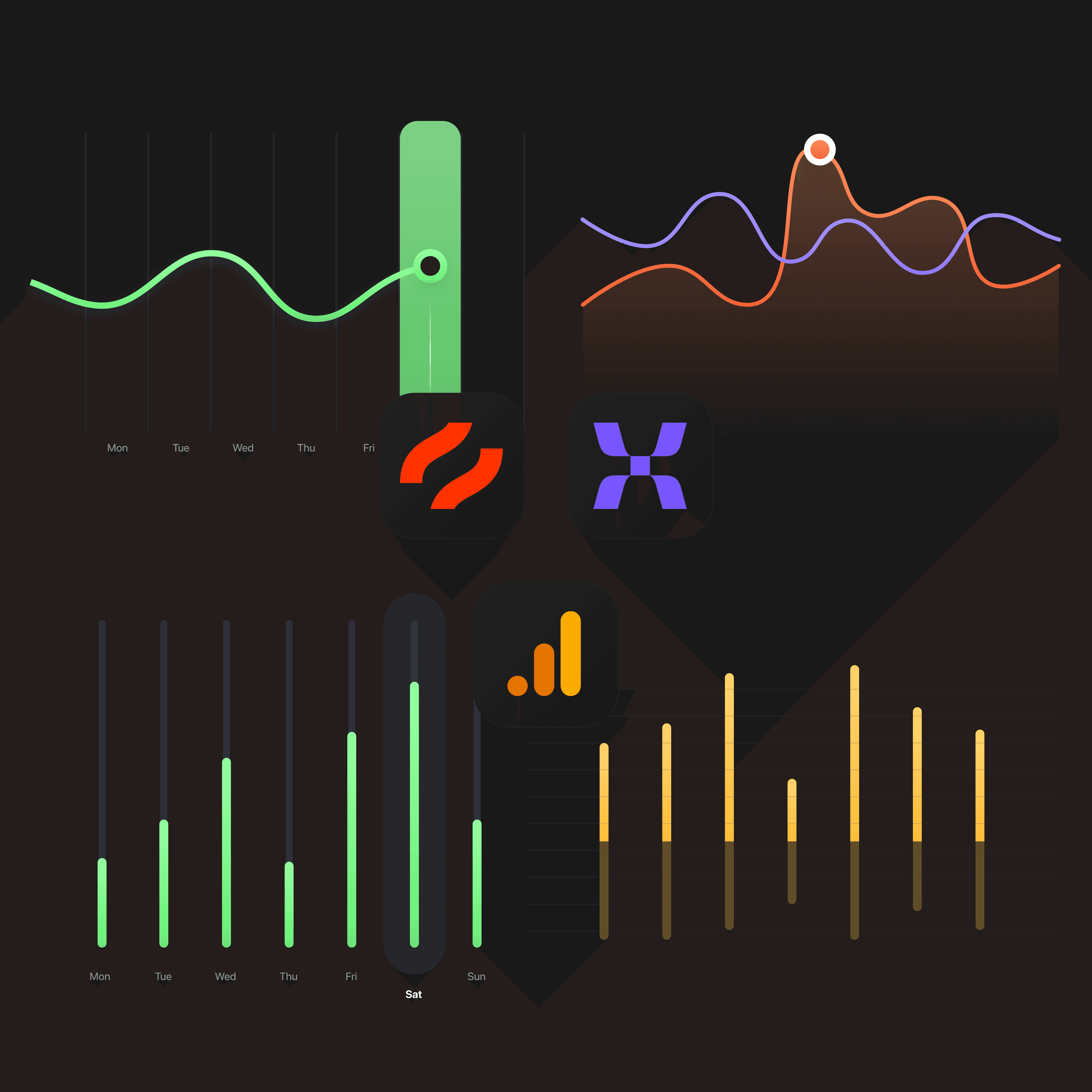
Raise analytics
I conducted data analysis to identify key issues that required further exploration through user research. I pinpointed several problems and prioritized them based on their potential impact on revenue:
#1
The contact form had a low conversion rate, with over 70% of users failing to submit their information.
#2
The business type selector was inefficient, with over 50% of users selecting “Other,” leading to low-quality leads that couldn’t be processed automatically. Additionally, more than one-third of users abandoned the funnel at the business type step.
Interview experts
I conducted interviews with the insurance operations and sales teams to gather their perspectives on the problems I identified. From these discussions, I concluded:
#1
Around 50% of users were entering fake phone numbers and email addresses.
#2
Some users were incorrectly specifying their business type, which led to issues with offer calculations and increased customer processing time.
#3
Users who selected “Other” for their business type were automatically categorized as low-quality leads and required additional processing time, as their offers needed to be calculated manually.
In-Depth Exploration – User Interviews
Leveraging the team’s network, I conducted user interviews and gathered the following insights:
#1
Many users struggled to find their specific business type, which led them to select “Other.”
#2
Users wanted clarification on why certain data was required and how it would be used.
#3
Users preferred providing approximate data due to privacy concerns and a fear of receiving spam calls.
#4
Users were accustomed to platforms like Check24 for insurance in Germany, which set a high standard for their expectations.
Conclusion of UX Research
#1
The contact form has a 70% abandonment rate because users lack trust and don’t understand how their data will be used.
#2
The business type selector has a 33% abandonment rate because users struggle to locate their business activity. As a result, many users either abandon the process or select “Other,” accounting for 50% of conversions.
Step #2: Define
Goal: Identify core problems, understand user needs, and define the project scope.
UX Methods:
User Personas
Problem Statement
User Personas
Based on the problems, needs, and behaviors identified during the research, I created three personas to represent the users throughout the design process:

Sally
Not Tech-Savvy, ADHD

Olga
Researcher

Marko
Executant
Set the Scope
Based on the data gathered from the research, I defined the scope of changes to be implemented, with clear priorities assigned based on the team’s capacity and available resources.
#1
Re-design the Business Type step to make it easier for users to locate their business activity, thereby minimizing the selection of “Other” and improving lead quality.
#2
Enhance the Contact Form to build user trust and improve clarity on how their data will be used, aiming to increase the conversion rate.
#3
Update the design of the self-service funnel with a focus on increasing user trust and applying a Mobile-First approach to ensure optimal usability across all devices.
Step #3: Ideate
Goal: Develop hypotheses for how to build the design to achieve the desired outcomes.
UX Methods:
How Might We Ideation
Affinity Mapping
How Might We Ideation
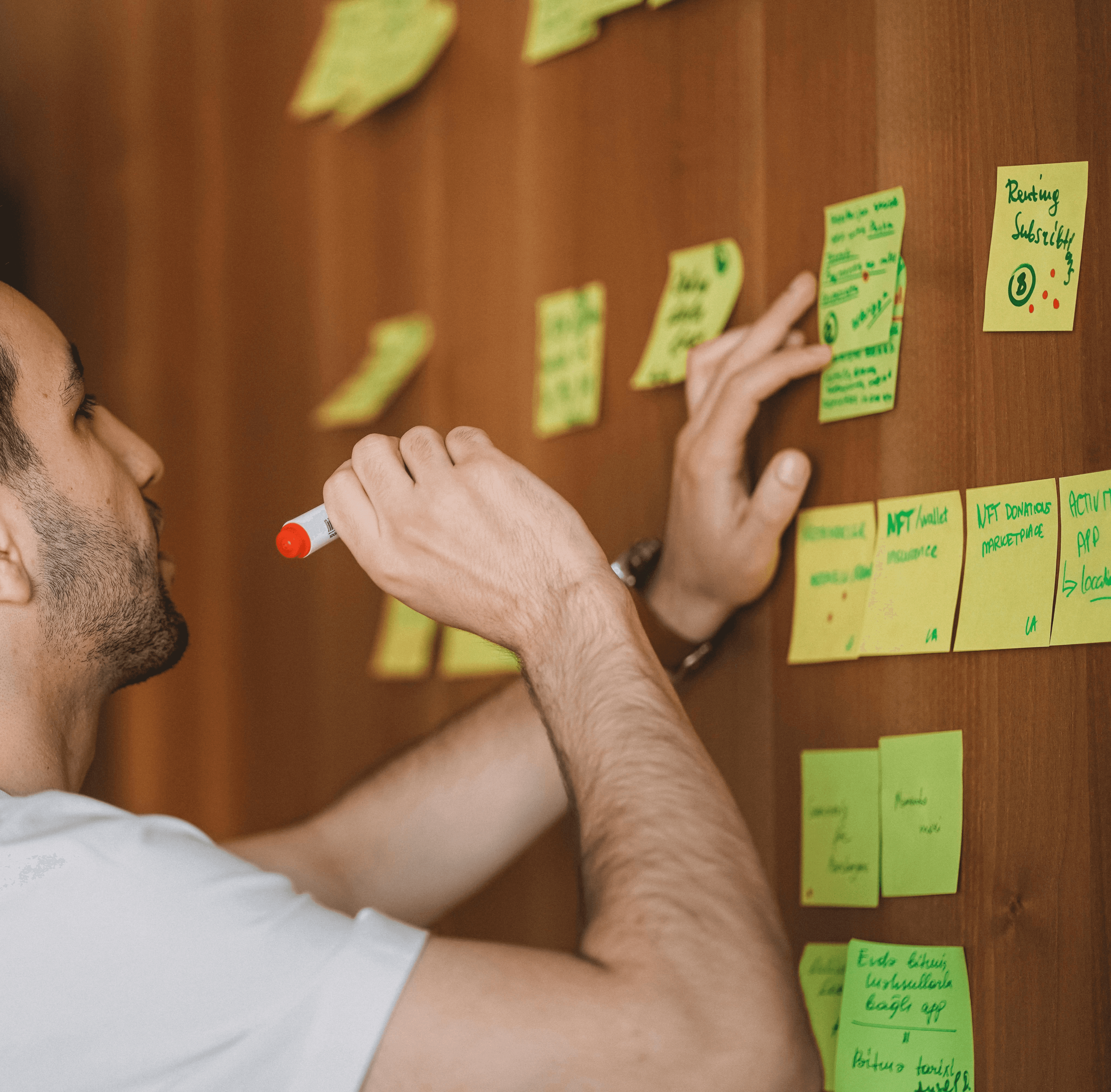
I planned two 45-minute ideation sessions. The first focused on the Business Type selector, involving 8 colleagues, including product managers and stakeholders. The second session targeted the contact form and included only the product team.
I guided the team through insights from the UX research, presented user personas, and outlined the scope of the problems we needed to solve. After the ideation, we collectively grouped and rated ideas using Affinity Mapping to prioritize solutions.
Step #4: Prototype
Goal: Build a prototype of the self-service funnel to test and validate design ideas with users, ensuring that the proposed changes effectively address the identified issues and improve the user experience.
UX Methods:
Information Architecture
Lo-fi Prototyping
Hi-fi Prototyping
Interaction Design
Design System
Information Architecture
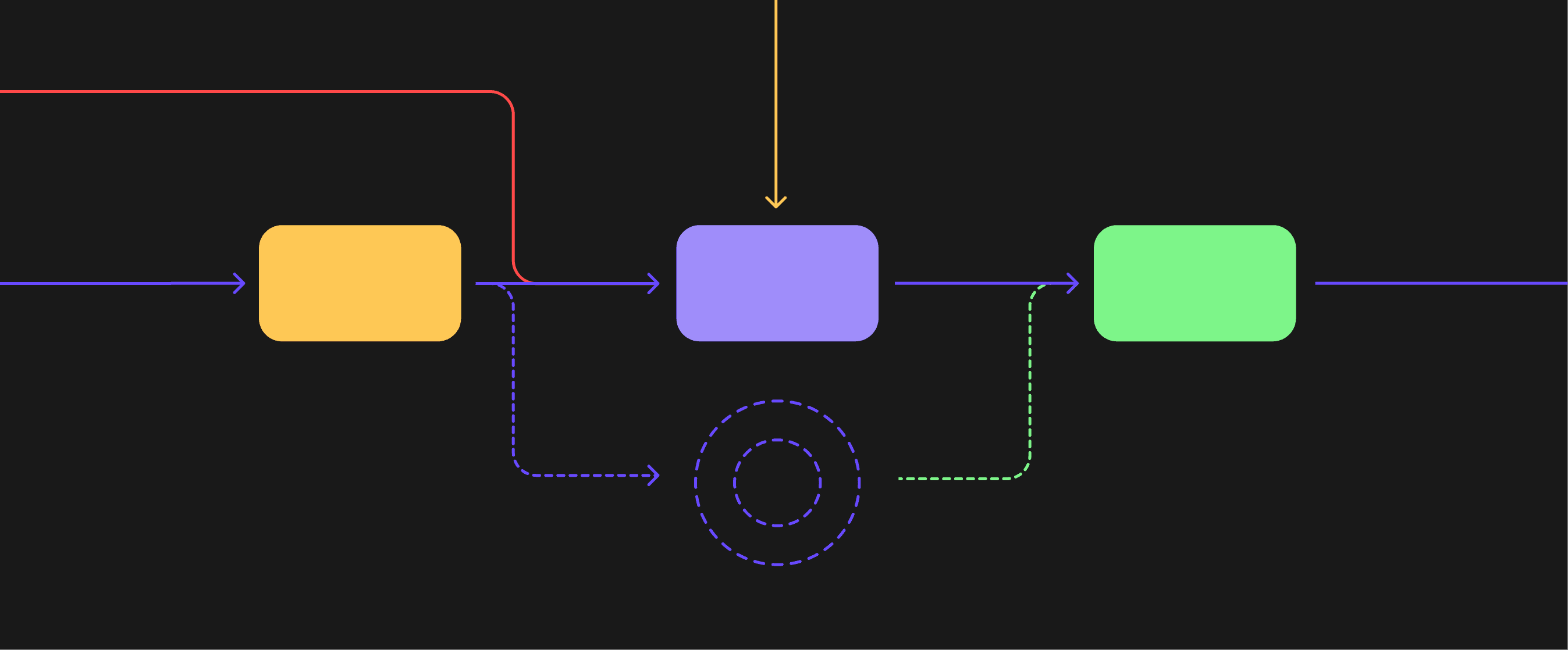
During the research, I discovered that some steps in the funnel had higher cognitive load for users and contained more “private” information, which made them harder to share. Based on the Goal-Gradient Effect (the tendency for motivation to increase as users get closer to completing a goal), I decided to reorder the steps—placing easier steps at the beginning and more challenging ones towards the end.
This change led to increased conversion rates on the more difficult steps, such as turnover, salary expenses, and employee count, by reducing friction and building momentum as users progressed through the funnel.
Rebranding, Fresh Look and Mobile First
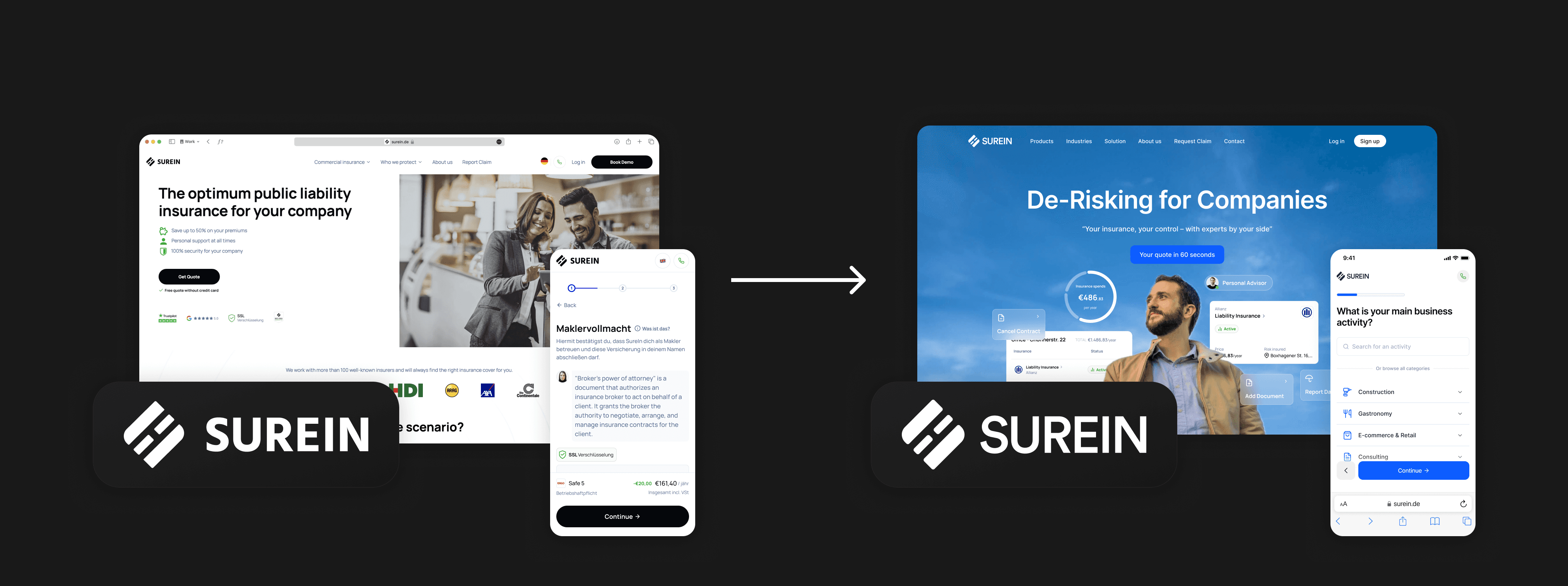
The original design had poor usability and a subpar mobile experience. Many of the design solutions seemed random and lacked a cohesive strategy. Additionally, the design system was unscalable, which hindered the ability to grow and adapt the product over time.
Rebranding & Design System
At the same time, I was leading the full rebranding of the company, which included redesigning the logo, messaging, website, and visual design. As part of this project, I created a scalable design system that aligned with the new visual identity, ensuring consistency and adaptability across all platforms.
Lower Cognitive Load
The screens were overloaded with content, including meaningless pictures on the right side and excessive text, making the interface cluttered. I streamlined the design by removing unnecessary elements, maintaining a minimalist approach that improved clarity and focused the user’s attention on key actions.
Mobile First
All components and screens were redesigned with a mobile-first approach. Fonts were set to dynamically adjust based on screen size to ensure readability across devices. Information on the screens was streamlined to maintain a clean look, even when dealing with long German words on smaller screens.
Business Type Screen
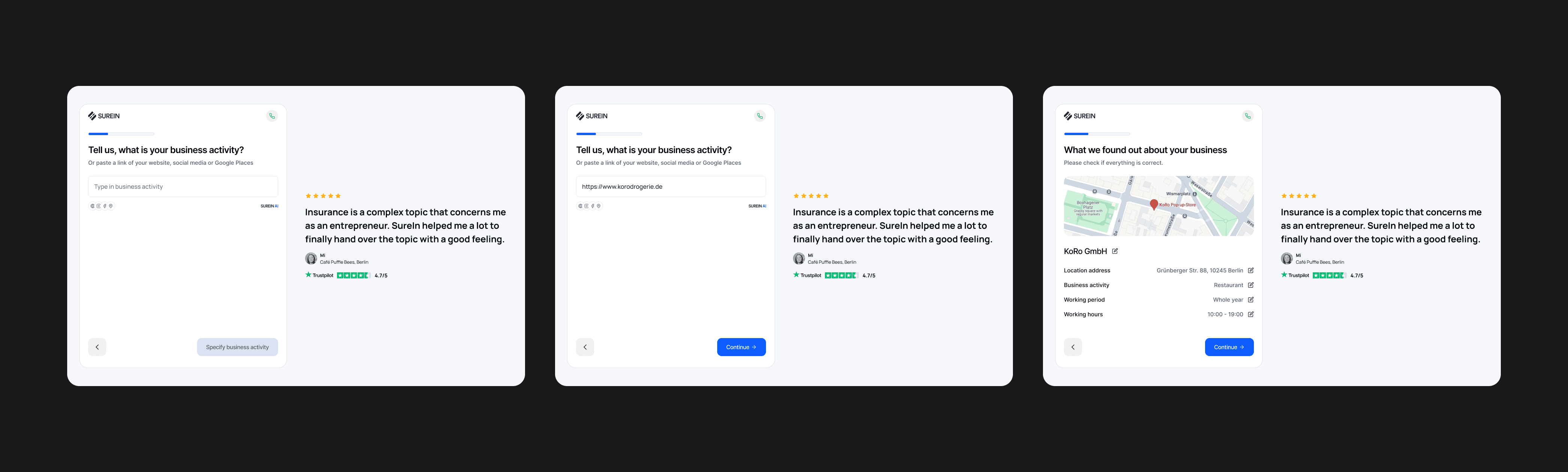
The initial version of the Business Type screen had a low conversion rate, a high mistake rate, and a significant number of users selecting the “Other” business type, largely due to poor usability and difficulty in locating the correct business type. During the ideation session, several ideas emerged for improvement. I decided to design the four most promising concepts and test them through a Usability Study, comparing them with the original version to determine which solution would best address the issues.
#1 Separated Branches and Business Activities
Another idea inspired by competitors was to have users first select their industry, followed by their specific business type. This two-step approach made the process more intuitive by narrowing down options based on the user’s industry. To improve usability, I decided to highlight the most popular industries at the top, followed by a list of other industries. This structure aimed to reduce friction by allowing users to quickly identify their industry and then focus on the relevant business types, leading to fewer mistakes and a more efficient user experience.
#2 Just Search
The idea was straightforward: with over 3,000 business types available, the most efficient way for users to find the right one was through search. Users could type in keywords, then select the most relevant business activity from the results. If their business type wasn’t listed, they could add a custom entry under “Other.” This approach aimed to minimize friction, speed up the selection process, and reduce the number of users defaulting to “Other” due to difficulty in locating their specific business type.
#3 Improved initial version
The idea was to restructure business activities and industries by introducing sub-business types. For example, instead of overwhelming users with a long list of options, the selection process would be broken into steps:
• Step 1: Choose a general category (e.g., Restaurant).
• Step 2: Specify details (e.g., Has delivery service).
This approach reduced the number of business types displayed on the first screen, making the selection process more intuitive. Additionally, icons were added to industries for better visual recognition, and short descriptions were included for each business type to provide clarity and help users make informed choices.
#4 AI Powered Search
The idea was to allow users to enter their business details in a free-form text field, where they could describe their activities in their own words. Additionally, users could paste a link to their website or social media profile, and AI would analyze the content to automatically map the business to the most relevant existing business type.
This approach aimed to:
• Reduce friction for users struggling to find the right category.
• Leverage AI to improve accuracy and minimize manual input.
• Provide a seamless experience by allowing users to share existing business information instead of selecting from predefined lists.
Contact Screen
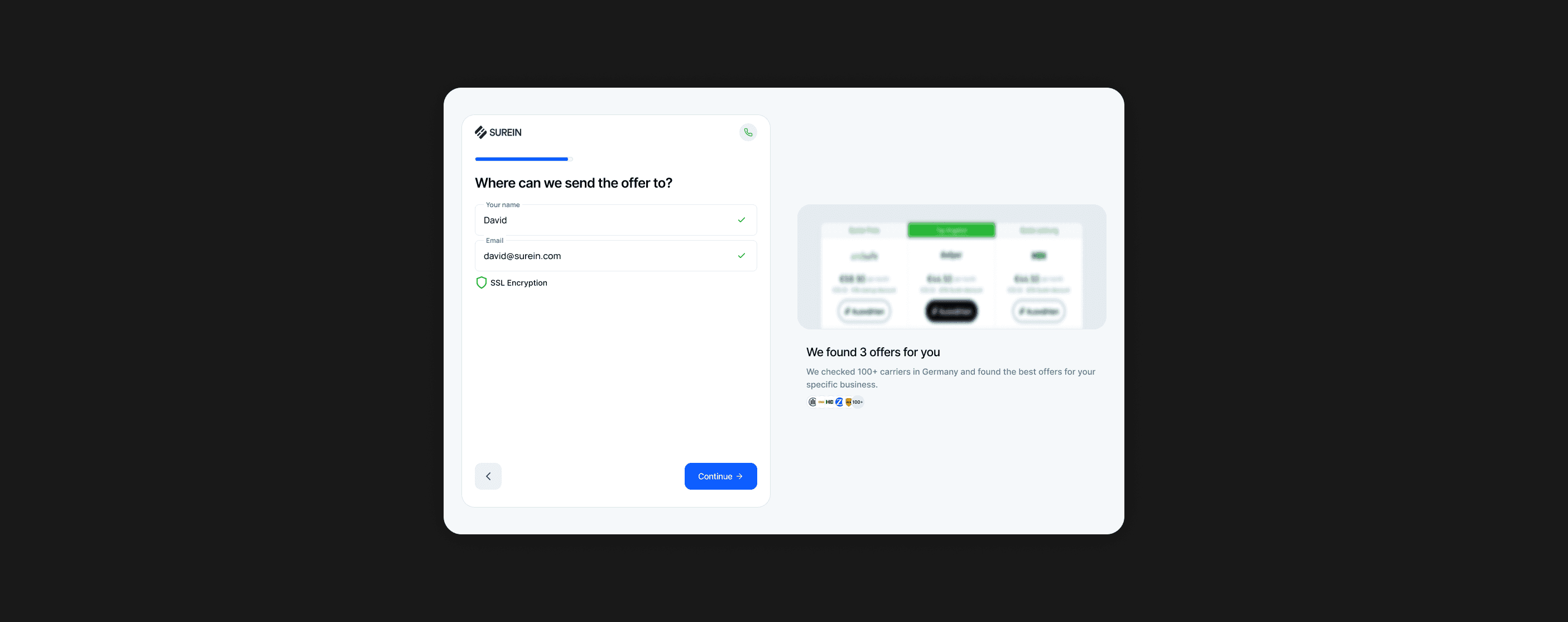
During the research, we identified that the Contact Screen had a 70% abandonment rate. During the ideation session, we brainstormed several ideas to improve conversion rates. To validate or reject these hypotheses, we planned to conduct quantitative A/B tests and measure their impact on user engagement and form completion rates.
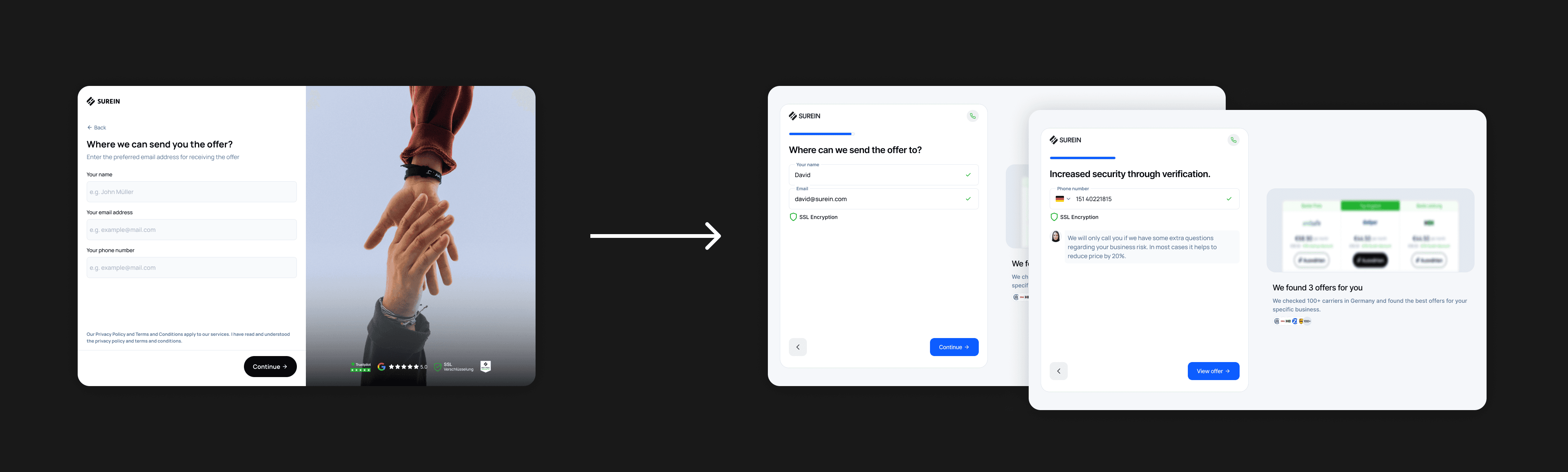
#1 Separate Phone Number from Email and Name
Hypothesis: If users hesitate to provide their phone number, separating the email and phone number into distinct steps will increase the conversion rate. Users will be more likely to enter their email when they don’t immediately see the phone number field. Once they’ve provided their email, they’ll be more inclined to continue and enter their phone number, as they’ve already started the process of sharing their contact information.
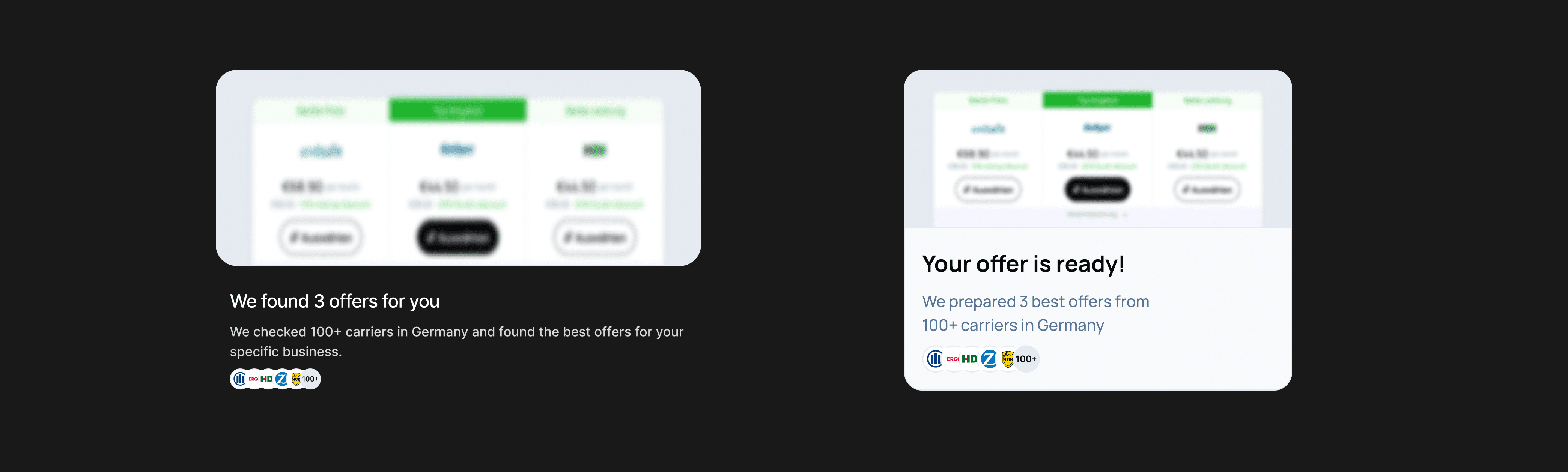
#2 Add Blurred Offer Screen
Hypothesis: If users see the calculated offer before entering their contact details and before seeing the final offer, they will be more likely to complete the contact step.
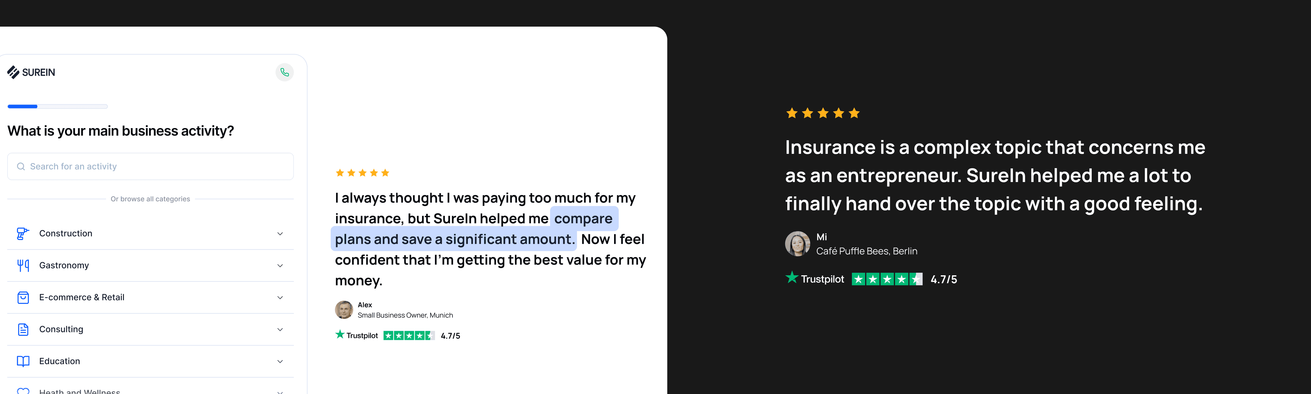
#3 Replace Picture with Testimonials
Based on my research, I identified that users had a low trust level toward the company. To enhance trust, we will replace the pictures with customer testimonials relevant to their business activity. These testimonials will change at each step of the funnel, ensuring that users see relatable feedback throughout their journey.
Step #4: Test
Goal: Test the performance of the hypotheses and select the most promising ones to iterate upon.
UX Methods:
Usability Study
A/B Testing
Observation
Interactive Prototyping
UX Survey
Business Type - Usability Study
To test the hypotheses for the Business Type Screen, I created interactive prototypes in Figma (and Framer for the search and AI-powered version). I conducted a moderated usability study with users, where we recruited participants from various user groups. During the study, users were asked to complete tasks using different versions of the Business Type screen.
Business Type - UX Survey
To gather a broader range of responses, I also conducted an unmoderated usability study using Maze. I collected feedback from various user groups and compared the results with those from the moderated usability study. The insights and feedback were then analyzed, and the most promising ones were selected for the A/B test.
Business Type - A/B Test
We tested three new versions one after another, and by the end, we identified the “money shot” design. We then started iterating on it. As a result, we increased the Business Type screen conversion rate to 84% and reduced the “Other” business type selection from 50% to 10%. This led to a 40% increase in high-quality leads.
Contact Screen - A/B Test
We tested changes incrementally, observing how each modification influenced user behavior and conversion rates. In the end, we settled on the setup with the highest conversion rate. Overall, I was able to increase the conversion rate of the contact screen by 118%.
Results
Highest Revenue in Company’s History
Thanks to the work of me and the team, we achieved the most successful quarter in the company’s history right before the start of the Series A funding round.
+118% to Click-to-Lead Conversion
By redesigning the funnel, we more than doubled the conversion rate.
+40% to Lead Quality
By optimizing user inputs and the business type selection process, we improved lead quality by 40%.
Increased Iteration Speed
Through the creation of a new design system, optimizing Design-Dev-PM collaboration, and migrating the website to Framer, I managed to double our iteration speed.
Rebranding
Alongside this project, I led the company rebranding, which significantly increased user trust in our brand.
User-Centered Design
I applied a scientific approach to design decisions, using UX research methods and UX laws to ensure the UI was both accessible and user-friendly.




Need a designer?
Hire me.
Ready for a design adventure, or need product design advice? Ping me for fun collaboration.